




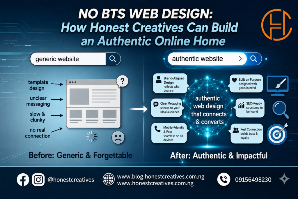
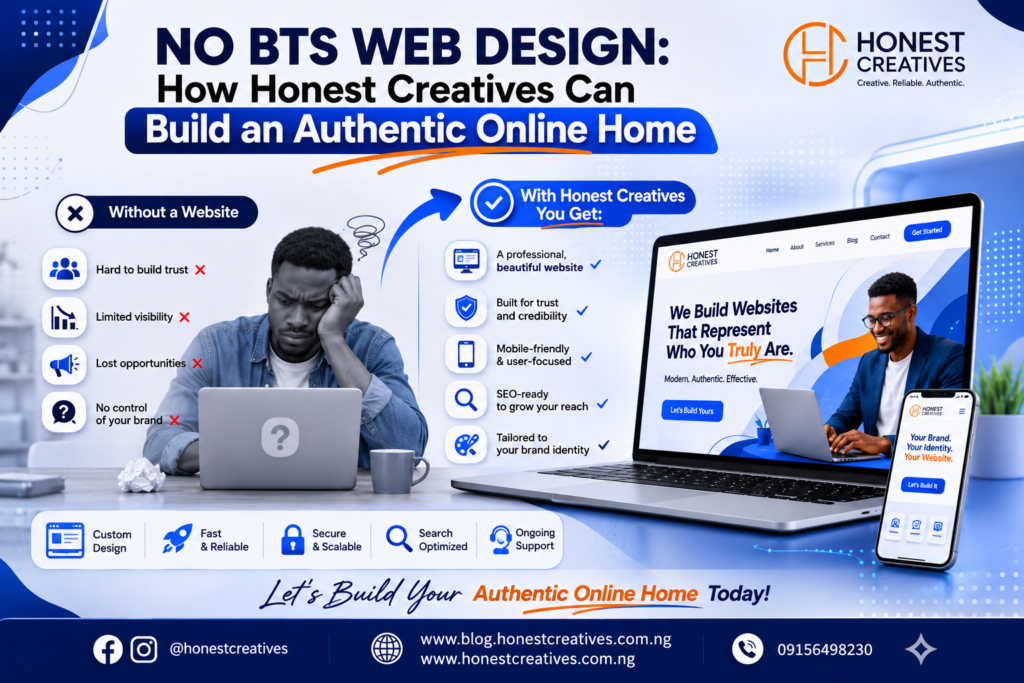
NO BTS WEB DESIGN: How Honest Creatives Can Build an Authentic Online Home
Let’s be real for a second. If you’re a creative whether you’re a photographer, copywriter, designer, or illustrator you’ve probably looked at standard marketing advice and wanted to throw your laptop out a window.
We’ve all seen the templates. The flashing “only 2 spots left!” countdown timers. The aggressive pop-ups blocking the screen before you’ve even read a single sentence. The hyper-polished, corporate jargon that says a whole lot of nothing.
If that makes your skin crawl, good news: you don’t have to trick people into working with you.
In fact, for independent creatives, honesty is your greatest competitive advantage. Here is how to design a website that feels entirely authentic to who you are, without sacrificing a single ounce of professionalism.
1. Ditch the “Bro-Marketing” Copy
Your website copy shouldn’t sound like a late-night infomercial. Honest web design starts with honest language.
- Speak like a human: Write your website copy the exact same way you speak to a client over coffee. If you wouldn’t say “I leverage synergistic paradigms to optimize your visual footprint” in real life, do not put it on your homepage.
- Be clear, not clever: Tell people exactly what you do within three seconds of them landing on your page. “I design minimal brand identities for independent coffee shops” beats a vague, poetic monologue every single time.
2. Let Your Work Do the Heavy Lifting
As a creative, your portfolio is the main event. Don’t bury it under five layers of navigation or hide it behind a “case study” that reads like a medical textbook.
- Show the messy middle: People don’t just buy the final product; they buy your brain. Share a glimpse of your process. Show early sketches, failed directions, and the actual problem you solved.
- Quality over quantity: Curate ruthlessly. It is infinitely better to show three projects you are fiercely proud of than twenty projects that just fill up space.
3. Embrace “Anti-UX” (The Good Kind)
Modern web design is obsessed with “frictionless conversion,” which often just means tricking people into clicking things. Honest design respects the user’s autonomy.
- Kill the aggressive pop-ups: If you want people to sign up for your newsletter, give them a compelling reason to do so in a dedicated section of your site, rather than hitting them with a full-screen takeover the second they arrive.
- Make navigation boring: This is not the place to reinvent the wheel. Keep your menu simple: About, Work, Services, Contact. If people have to play a guessing game just to find your email address, they will leave.
Honest Design Rule #1: If a design element feels manipulative to you when you experience it on other sites, do not inflict it on your own audience.
4. Be Radically Transparent About Pricing and Process
Nothing builds trust faster than pulling back the curtain. The old-school mentality says you should hide your prices to get people on the phone so you can “sell” them. Honest creatives don’t have time for those games.
- Give a ballpark: If your work is highly custom, you don’t need to post an exact price list. But giving a starting rate (e.g., “Identity packages start at $3,500”) filters out bad fits immediately and respects everyone’s time.
- Outline the steps: Map out what it’s actually like to work with you. Step 1: Discovery call. Step 2: Strategy. Step 3: Design. Step 4: Launch. When clients know what to expect, their anxiety drops to zero.
5. Don’t Hide Behind “We” If You’re an “I”
If you are a solo freelancer, own it. Don’t use “we” or “the team” on your About page to make yourself look like a massive agency.
Clients choose independent creatives because they want a direct, personal relationship with the person doing the work. They want you your unique eye, your specific voice, and your undivided attention. Presenting yourself honestly as a powerhouse solopreneur is incredibly magnetic.